
Newsletter Subscribe
Enter your email address below and subscribe to our newsletter

 ByJohn A
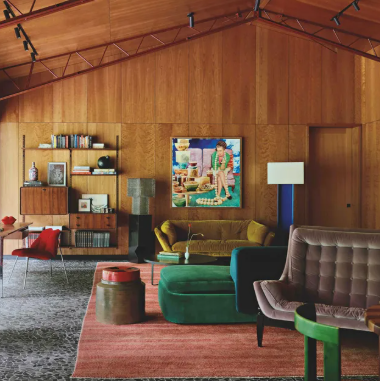
A room where every object matches can look finished at first glance, yet it may offer little reason to keep looking. The sofa matches the cushions, the cushions repeat the artwork, and the accessories all announce the same theme. Coastal interiors are especially vulnerable to this effect because their visual language is familiar and easy to reproduce. The antidote is not disorder; it is selective contrast. Let the landscape establish a mood, then introduce materials, furniture, and personal objects that relate to it without copying it exactly.
The coast itself is not coordinated. Water changes colour with depth and weather; sand may be pale, rust-coloured, or dark; rocks, grasses, buildings, and clouds create irregular contrasts. An interior inspired by that complexity can use a controlled palette while allowing materials and objects to vary. A simple seascape may sit above a vintage timber table, a contemporary lamp, and a woven rug. The room feels connected because the elements share a sense of texture and restraint, not because every piece belongs to the same collection.
Architectural Digest’s overview of coastal design emphasises natural textures, soft neutrals, and clean lines while advising against overly literal nautical decoration. This is a useful framework for a room that should feel collected rather than staged. It allows the homeowner to mix old and new, smooth and rough, quiet and expressive. The guide [Coastal Interior Design: Everything You Need to Know](https://www.architecturaldigest.com/story/coastal-interior-design-101) explains how coastal style can remain tailored and timeless without relying on a repeated set of beach motifs.
Art is a strong place to introduce controlled difference. If the room is pale and minimal, a dark black-and-white ocean photograph can provide a focal point. If the furniture is dark or traditional, a lighter beach image can create relief. A photograph of a pier or coastal building may add geometry to a room dominated by soft upholstery. These choices are more interesting than simply selecting an image whose colours match the cushions, because they create a relationship between the art and the room rather than making them interchangeable.
A useful editing method is to choose one dominant quality and one contrasting quality. The dominant quality might be a warm neutral palette, natural wood, or a quiet landscape. The contrast might be a dark frame, a colourful ceramic, a modern metal lamp, or a single image with strong tonal drama. The rest of the room should support those choices without competing. If everything is an accent, nothing becomes the focal point. If everything is quiet, the room may lack character. A deliberate imbalance often gives a space its personality.
The same principle applies to frames and gallery walls. Identical frames can create a formal grid, which may suit a contemporary interior, but a collected arrangement can benefit from two related finishes or varied image sizes. Keep some consistency—perhaps similar tonal range or subject matter—while allowing the pieces to differ in composition. A black-and-white photograph, a small drawing, and a colour image of a headland can sit together if their proportions and visual weight are carefully balanced. Diversity should feel intentional rather than random.
When browsing coastal artwork, look for a piece that adds something missing from the room rather than another version of what is already there. A monochrome image from the black-and-white coastal collection may bring definition to a soft palette; a muted colour photograph may warm a space full of black and white. The artwork should influence the room, but it should not dictate every subsequent purchase.
A home feels personal when it contains evidence of choices made over time. A coastal photograph can be the starting point for a room, but it should share space with books, inherited furniture, objects from travel, and the practical things that make daily life possible. A little inconsistency is not a design flaw. It is often what stops a room from feeling like a showroom. The goal is not perfect coordination; it is a clear point of view that leaves room for the people who live there.
Collected interiors also benefit from objects that are not perfectly aligned with the palette. A colourful book spine, a handmade bowl, or a chair inherited from a relative may introduce a note that no stylist would have planned. Those details keep the room from feeling like a visual exercise. The coastal artwork should create a relationship with them, not erase them. A monochrome image can make a vivid object feel intentional; a colour photograph can connect a warm wood finish to a muted wall. When the room has a clear foundation, small differences create character instead of disorder.
When in doubt, leave a little room for contrast. It is often the unexpected object—not the perfectly matched accessory—that makes a space memorable. A coastal image can provide the common thread while the rest of the room remains open to change.
